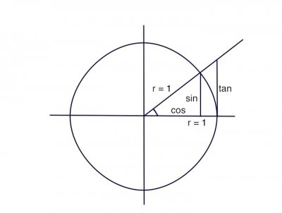
I found a unit circle to be invaluable in visualizing trig. I have no idea if it will help you, but take a look. This is a very geometric way of looking at things.
A unit circle has a radius of 1, and of course you know that similar triangles will have similar ratios.
If you look at my little attached drawing (see thumbnail), the angle that is marked has a sin of the opposite over the hypotenuse (and the hypotenuse is the radius and equal to 1). That means the sin is the height of that line segment. As the angle gets smaller toward zero, the sin gets shorter and goes to zero. As the angle goes to 90 degrees traveling counterclockwise, the sin goes to a max of 1, the radius. Then the angle gets to the other side, negative x, and the sin goes back toward zero and continues toward negative one.
The cos does the same. When the angle is zero, cos is 1, and it shrinks to zero as the angle goes to 90 degrees, and so on.
Now for the tan. There is a similar triangle there, with the same angle we had before. If you look, sin/cos = tan/1, or sin/cos = tan. Also, when the angle is zero, tan = 0, and goes up to + infinity when the angle is 1.
When it is a 45 degree angle, sin = cos, and there is an isosceles triangle with tan = 1.
I also found it handy to learn how to draw sin and cos waves, with a few memorized points:
sin 0 = 0
sin 30 = .5
sin 45 = .707 or (√2)/2
sin 60 = .866 or (√3)/2
sin 90 = 1
and the corresponding values for cos, plus where they go negative.
I know, memorizing isn't as good as deriving something, but a few handy facts really do make things faster.
As for logarithms, look at some log charts. For example, Google Finance will show charts of any given stock, and you can set them to have a log scale. You can just see how the scale changes with the value. The cool thing about logs is that if you double (or triple, or half) your value, the distance on the graph is the same regardless of where you started. So if a stock goes up by 10%, it looks the same whether it goes from $30 to $33 or $9000 to $9900.
For a visual example, go to
http://www.google.com/finance?q=goog, a fairly volatile stock. Set the chart to show 5 years, and click Settings. Change between linear and logarithmic to see the difference. A move from $200 to $400 will either look the same as a move from $400 to $600 (linear, same dollar difference) or the same as a move from $300 to $600 (logarithmic, same percentage move).
Play around with the Richter scale, and try to figure out how much bigger a 6.5 is than a 6.0. Decibels are logarithmic, too. The more you see logs, the less they feel confusing. None of this will teach you techniques for using logarithms, but they will help in visualizing what they do. Exposure really matters, so I second Vrecknidj about doing lots of examples.

 )
)